College of the Siskiyous (Siskiyous) strive to fully include all who engage with us by ensuring that communications and content are accessible to everyone. As a public institution that receives federal, state, and local funding, we are legally required to comply with federal laws known as the Americans with Disabilities Act (ADA) and the U.S. Rehabilitation Act of 1973. Accessibility has many components and covers a range of topics that are too vast to include here. For the purposes of this guide, we will focus on some of the most common accessibility-related issues for digital communications.
We encourage you to be mindful of accessibility across the entire range of media as communication trends, technology, and delivery platforms evolve.
Why It's Important
An estimated 13 percent of Americans – about 42 million people – have a disability. Inaccessible content excludes people just as much as steps prevent someone with a physical disability from entering a building. Inaccessible content denies them equal access to information, which many courts have ruled a violation of the Americans with Disabilities Act (ADA). The ADA can be complicated, but it's intent and spirit – to ensure that those with disabilities have the same opportunities as everyone else – aligns with the College of the Siskiyous mission of inclusivity.
Section 508 and ADA
Section 508 and ADA are terms that are often used interchangeably, but they are technically separate and unique. The ADA addresses accessibility in a broader sense, while Section 508 focuses on electronic content. Section 508 is a sub-section of the U.S. Rehabilitation Act of 1973 that requires electronic content to be accessible to people with disabilities. It also sets accessibility standards for websites and other digital communication tools and content, known as information communication technology. Section 508 was not part of the original Rehabilitation Act of 1973 but was added in 1998 to include accessibility requirements for all information technology.
Equal Access for Everyone
People with disabilities access digital content and navigate the web in a variety of ways:
People who are blind or sight-impaired may use screen readers, which are devices that read aloud the text that appears on a screen, or screen magnifiers, both physical and software-based.
People who are deaf or hard of hearing may rely on captions or transcripts. Videos should be captioned, and transcripts should accompany audio content. See Video & Audio
People with mobility impairments may not be able to use a mouse, may rely on head pointers to interact with computers, or may require voice-recognition software to control their computers and devices with verbal commands.
People with cognitive impairments experience a common set of functional issues that can be minimized by providing:
Easily understood content using plain language.
A clear focus on important content with minimal distractions.
Logical, consistent design and layout of documents.
Intuitive, consistent layout and navigation of websites and online content.
EXAMPLE – You should not post a flier as an image. Textual information displayed as a JPG or PNG has no actual text that a screen reader recognizes. Such content is inaccessible to a sight-impaired individual – and a violation that puts you and the district at risk.
Writing
The foundation of an accessible document is content that clearly and concisely conveys your message. This information applies not only to digital documents and content, but to all communications in its various forms.
General Guidelines
Write clearly and use plain, straightforward language.
Use short declarative sentences whenever possible.
Keep content lean and relevant. More copy is not necessarily better, so eliminate unnecessary content that doesn't get your message across.
Use language your audience understands. Don't get overly technical, avoid jargon, and provide definitions of institutional-specific terms that cannot be avoided.
Acronyms and abbreviations may be ubiquitous at College of the Siskiyous, but they are not necessarily decipherable by external audiences. Avoid acronyms and abbreviations whenever possible. If you must use them, spell them out after first use.
Examples
POOR: The Orientation will be held in LRC-2.
GOOD: The orientation will be held in the Learning Resources Center, Room 2.
POOR: The ASC is located in the LRC.
GOOD: The Academic Success Center is located in the Learning Resources Center.
Do not abbreviate names of college buildings or departments. While abbreviations may appear in internal systems like class schedules, they can be unclear to prospective students and the public. Always write out full names in marketing and communications materials.
PDFs
Most Microsoft 365/Office and related applications have accessibility features and settings that, when utilized, produce accessible PDFs that can be shared electronically.
General Guidelines
Proper document structure utilizing headings, lists, and other element markups allows screen reader users to navigate content logically and efficiently.
Become familiar with the application's accessibility features.
Images and other visual elements require alt text.
Body text should be large enough (a minimum of 11 point type) for people to read.
Page margins should be no less than 0.5 on all sides (1.0 is preferable).
Left-aligned text is easiest to read. Center-aligned text should be used sparingly.
Do not write sentences in ALL CAPITAL LETTERS. They are harder to read. Limit the use of all-caps to sub headers and brief headings.
Use styles such as italics, bold, and underline selectively, and avoid using them for entire paragraphs.
Helpful Tips
Built-In Help – In Microsoft 365/Office applications, search for Accessibility Checker or Accessibility Assistant for step-by-step guidance.
Resolving Errors – Resolving accessibility issues in Adobe Acrobat is more challenging and time-consuming than simply addressing the issues in the source application and exporting a new PDF.
Think Twice Before Underlining – Do not underline words unless they are hyperlinks.
Contrast and Background – Use enough contrast between text and background to ensure readability, and avoid using backgrounds that make overlay text hard to read. Use text over solid or subtly textured backgrounds rather than images or patterns; adequate contrast still applies.
Online Design
The proliferation of online graphic design platforms has simplified the design process, making it easy for anyone to create professional-looking marketing material with predesigned templates. But users should not assume that material generated by these services meets accessibility standards. Care should be taken to ensure that the template is accessible, and that subsequent edits and additions follow accessibility guidelines and practices.
Canva
Canva is a popular online design platform at College of the Siskiyous. It's also notorious for producing inaccessible documents. But that's not necessarily the platform's fault. It is the user's responsibility to ensure accessibility guidelines are followed. Like the design process itself, Canva has simplified the process for checking accessibility compliance with a tool called Design Accessibility. Learn more about Canva's accessibility features.
Canva Design Accessibility
Follow these steps:
Open the design you'd like to check for accessibility.
From the Editor menu, select File, then click Settings.
Select Check Design Accessibility from the options to open the Design Accessibility window.
You'll see a summary of detected accessibility issues for typography, color contrast, and alt text, as well as steps to take to resolve these issues. Please note that this tool alone may not detect all accessibility issues, especially for PDFs, so the final document must be checked for accessibility compliance with a third-party application. See Accessibility Checkers.
Color Contrast
Color contrast is key to legibility and accessibility. Whether you're creating a PDF, an event poster, or designing a webpage, it's important to consider readability. Color combinations, reverse type, and type overlays can be challenging from an accessibility standpoint.
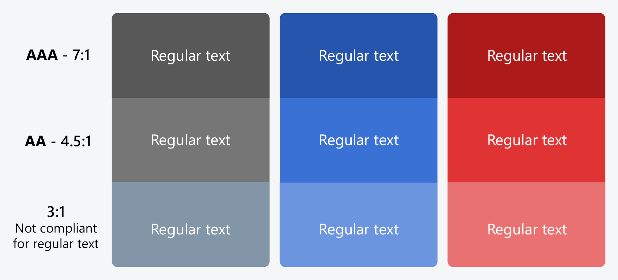
Contrast Ratio
Web Content Accessibility Guidelines (WCAG) require a contrast ratio of at least 4.5:1 for normal text and 3:1 for large text to achieve minimum compliance. Large text is defined as 14 point (typically 18.66px) and bold or larger, or 18 point (typically 24px) or larger.
Checking Compliance
For websites and online media, use a web-based color contrast checker to check accessibility compliance. Color and link contrast checkers are available at no charge from WebAIM.
Chrome Extension – The WCAG Color contrast checker is available as a free extension to the Chrome web browser. Visit the Chrome Web Store to install it.
TIP – Don't use color as the only way to convey information. Use text or an icon as well.
Alt Text
All images should have alternative text, or alt text, added. You can add alt text for images on Facebook, Instagram, Twitter, and LinkedIn.
All non-decorative images must be accompanied by a written description known as equivalent alternative text, more commonly referred to as alt text. Alt text is a description of an image that is read aloud to visually impaired users via a screen reader. Write alt text as if you were describing the visual scene of the image to someone over the phone. Tell them what you see, concisely.
General Guidelines
Limit alt text to no more than 125 characters, or 250 characters for grouped images such as collages.
Avoid filler words such as "this is a photo of."
If the image consists primarily of embedded text, that text should be used verbatim as the alt text.
If an image is used to provide direction or guide the user (such as an arrow), the alt text should guide the user in the same direction.
Example
POOR: Student Center.
GOOD: Outside of Student Center with trees and Mt. Shasta in the background on a sunny day.
Social Media at College of the Siskiyous
Social media accounts at College of the Siskiyous must make every effort to make the content they share accessible to all audiences. The College of the Siskiyous official social media accounts will only share, repost, and retweet accessible content.
Alt Text for Social Media
You can add alt text to images in social media posts using each platform's edit or advanced settings feature. See instructions below.
If image descriptions are automatically generated, make sure to review and modify the descriptions to capture the appropriate meaning and context.
If you are including alternative text in the field provided by the social media platform, it is redundant to also include it within the post, as people using screen readers will then have to hear it twice.
When placing text on a colored background, make sure the text is accessible by using a contrast checker.
X (Twitter)
Follow these steps to enter alt text for images:
Click the Post compose
Attach your photo(s).
Click Add description.
Type your description of the image and click Done.
Descriptions can be added for each image in a post.
Facebook
Follow these steps to edit alt text for images:
Click Photo/Video at the top of your Feed.
Select the photo you want to add.
Hover over the photo and click Edit.
Click Alternative text in the menu on the left side.
The automatically generated text will be shown on the left side of your photo. Click Override generated alt text to edit it.
Write your alt text in the box. To change back to the automatically generated text, click Clear.
Click Save at bottom left.
Instagram
Follow these steps to edit alt text for images before you post:
Upload an existing photo.
Choose a filter and edit the image, then click Next.
Click Accessibility, then write alt text in the box.
Click Share to post.
Follow these steps to change the alt text of a photo after you post:
Above your photo or video, click …
Click Edit.
Click Accessibility, then write the alt text in the box.
Click Done to save changes.
LinkedIn
Follow these steps to add or edit alt text for images:
Uploading your image.
Click text below image.
Enter your alt text.
Click Save.
X (Twitter)
Photos and GIFs: Directly on Twitter, you can add alt text to photos and animated gifs by choosing “add description” after you’ve uploaded the file. Most social media management platforms offer alt text capabilities as well.
Videos: All videos must be captioned. You can:
Add captioning to videos by uploading .SRT files via the Media Studio Library
Add captions directly to the video ("burned in" captions)
Upload videos to YouTube and add captions there, then link to the video in your tweet
Hashtags and emojis: Make sure to use CamelCase for hashtags, do not include too many hashtags or emojis, and do not place emojis between words. See the General section for more details.
Mentions: Limit the number of handles you mention in your tweets, since screen readers will read them out.
Unicode text: We do not recommend using unicode text since it is often inaccessible to screen reader users. Screen readers may skip the text entirely or read something irrelevant to the user.
Facebook
Images: Although Facebook automatically adds alt text, it is very often inaccurate, and we recommend editing the autogenerated alt text. You can do this by clicking “options” on the photo and choosing "change alt text."
Videos: You can add captions by uploading .SRT files. Alternatively, you can use the auto-generated captions created by Facebook, but make sure to edit the auto-generated captions to ensure they are accurate.
Lives: It is important to provide live captions to live events whenever possible. If it is not possible to have captions as the event is proceeding, provide captions as soon as possible after the event.
Unicode text: We do not recommend using unicode text since it is often inaccessible to screen reader users. Screen readers may skip the text entirely or read something irrelevant to the user.
Instagram
Images: Add alt text on all images. Some social media publishing tools allow for alt text to be added during the scheduling process. If publishing live, on the final screen before publishing your post, tap “Advanced Settings” at the bottom and “Write Alt Text” will be an option under the accessibility section.
Videos: Videos posted as feed posts or Reels will need burned in captions. Captioning is available for Stories but should be reviewed and edited before publishing.
Hashtags and emojis: Make sure to use CamelCase for hashtags, do not include too many hashtags or emojis, and do not place emojis between words. See the General section for more details.
Note: CamelCase is a writing style for multi-word phrases or identifiers that removes spaces and punctuation, capitalizing the first letter of each word except sometimes the first. It is widely used in programming (e.g., camelCase, firstName) and branding (e.g., FedEx, iPhone) to improve readability.
LinkedIn
Images: You can add alt text to photos by choosing "add alt text" after uploading. On desktop, if you don’t add alt text, LinkedIn may automatically generate it after you post. You can edit that text anytime.
Videos: On desktop, you can add captions by uploading an .SRT file. Uploading via mobile does not allow for captions.
Animated GIFs
GIFs are not available to be used on all platforms, and not all platforms have a way to add alt text to GIFs. If a platform doesn’t allow for alt text on GIFs, the content may be difficult for individuals who rely on screen readers to perceive.
X (Twitter) does allow for alt text on both images and GIFs.
Do not rely solely on animated GIF content in a social media post. When using animated GIFs, confirm that the post can be understood through its text content alone. You can also consider adding a brief description in brackets at the end of a post to account for this issue.
Hashtags
Use what is known as "CamelCase" for hashtags in your social media posts, capitalizing the first letter of each word – #SiskiyousInSummer. This formatting means that people using screen readers will hear the words individually rather than as a long incoherent word, as is likely to be the case if no letters are capitalized.
Note: CamelCase is a writing style for multi-word phrases or identifiers that removes spaces and punctuation, capitalizing the first letter of each word except sometimes the first. It is widely used in programming (e.g., camelCase, firstName) and branding (e.g., FedEx, iPhone) to improve readability.
Limit the use of hashtags in each post, knowing that screen readers will read all hashtags out to users.
Emojis and Emoticons
Screen readers will read emojis as their description, e.g., "clapping hands." Because of this, it can be confusing if emojis are placed between words. Do not overuse emojis in social media posts, and place a space between each one.
Emoticons, or representations of expressions created through a variety of keystrokes, e.g., ;), will be read as "semicolon parenthesis" and should be used sparingly, if at all.
Infographics
Make sure colors are well contrasted, so they are easy to decipher for people who are colorblind or have a visual impairment.
Infographics are images and should include alt text.
Hyperlinks
Keep URLs short whenever possible because screen readers will read them out to users, just as if they were words strung together in a long hashtag. There are many tools available that offer a free and easy way to shorten your URLs.
Plain Language
Avoid acronyms and make sure the meaning of your social media posts are clear.
Video & Audio
Just as alt text provides context for images, video captioning and audio transcripts help make media accessible to people with visual or auditory impairments.
All videos should have captions of the audio for the benefit of those without hearing, who are hard-of-hearing, and who are non-native speakers. Captions can be either closed captions (where a user can turn them on and off) or open captions (where the text is embedded into the video and cannot be turned on or off).
Text on screen should be accessible. You can use a contrast checker to make sure the foreground and background colors have enough contrast.
Videos and other media should not automatically play on default. This type of content can be a barrier for those with cognitive impairments, photosensitive epilepsy, ADHD, and other conditions. Users should have the ability to pause videos and other media. If media plays by default and this feature cannot be turned off, users should be made aware of this, e.g., "This video will automatically play in a new window."
Captioning
Videos must be captioned to be accessible. There are two types of captions: open and closed. Open captions are always in view and cannot be turned off, whereas closed captions can be turned on and off by the viewer. You can caption a video yourself with a free caption-editing tool, use a paid service provider, or utilize platform-specific captioning tools.
YouTube, Facebook and Vimeo
YouTube, Facebook, and Vimeo support closed captioning, so open captioning is not necessary. College of the Siskiyous accounts should make every effort to caption videos on YouTube. Auto-generated captions are not sufficient to meet accuracy standards without substantial editing and proofreading for quality assurance. It's important to proofread and correct the closed caption file before publishing and promoting your video, as auto-generated caption files often contain misspellings and errors.
X (Twitter), Instagram, and LinkedIn
X (Twitter), Instagram, and LinkedIn do not support closed captioning. Open captioning is required for accessibility compliance. Please refer to the specific platform for instructions on creating and loading open captions.
Tips
Convert your audio to captions using a caption-editing tool or service.
Most caption-editing tools include the ability to export a transcript.
Transcripts should include all audio, on-screen text, and any necessary visual information.
Websites
When providing updates for web pages, please follow these guidelines:
Do not write sentences in ALL CAPITAL LETTERS. They are more difficult to read. All-caps are acceptable in limited circumstances, such as short page or section headers, but it’s generally best to avoid them whenever possible.
Do not underline words unless they are hyperlinks.
Follow a logical content hierarchy: Heading 1, Heading 2, Heading 3, Paragraph, etc. Headings should be used in numerical order starting at the top of the page (e.g. Heading 1 cannot follow Heading 2 or 3).